

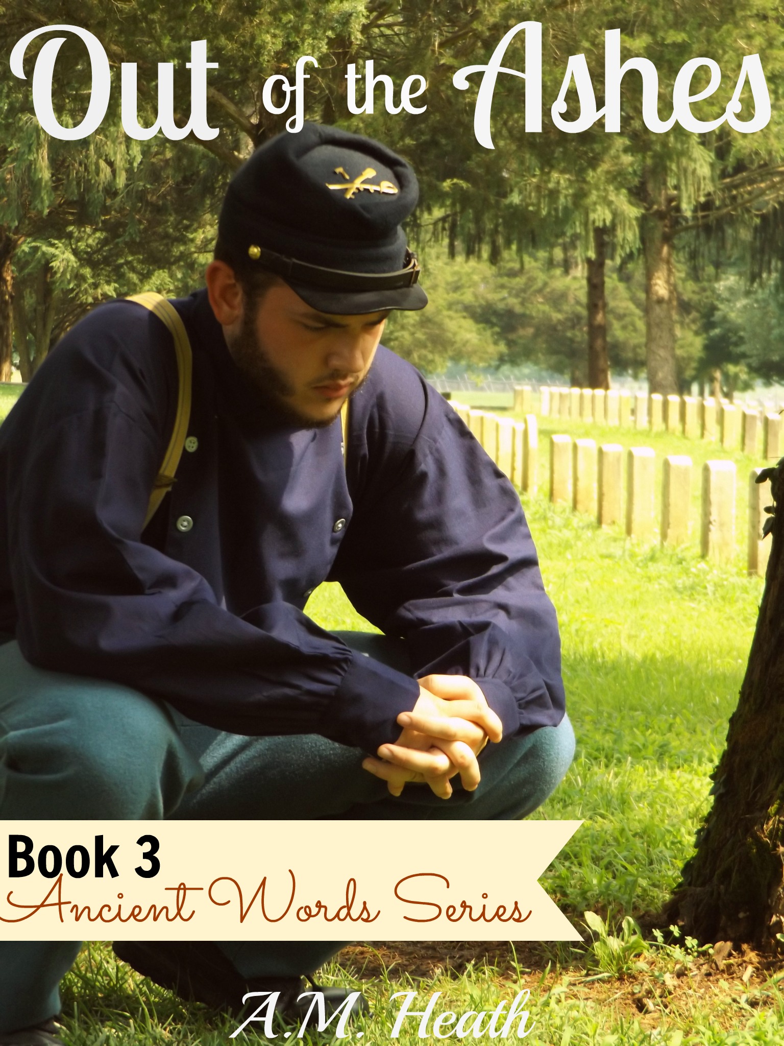
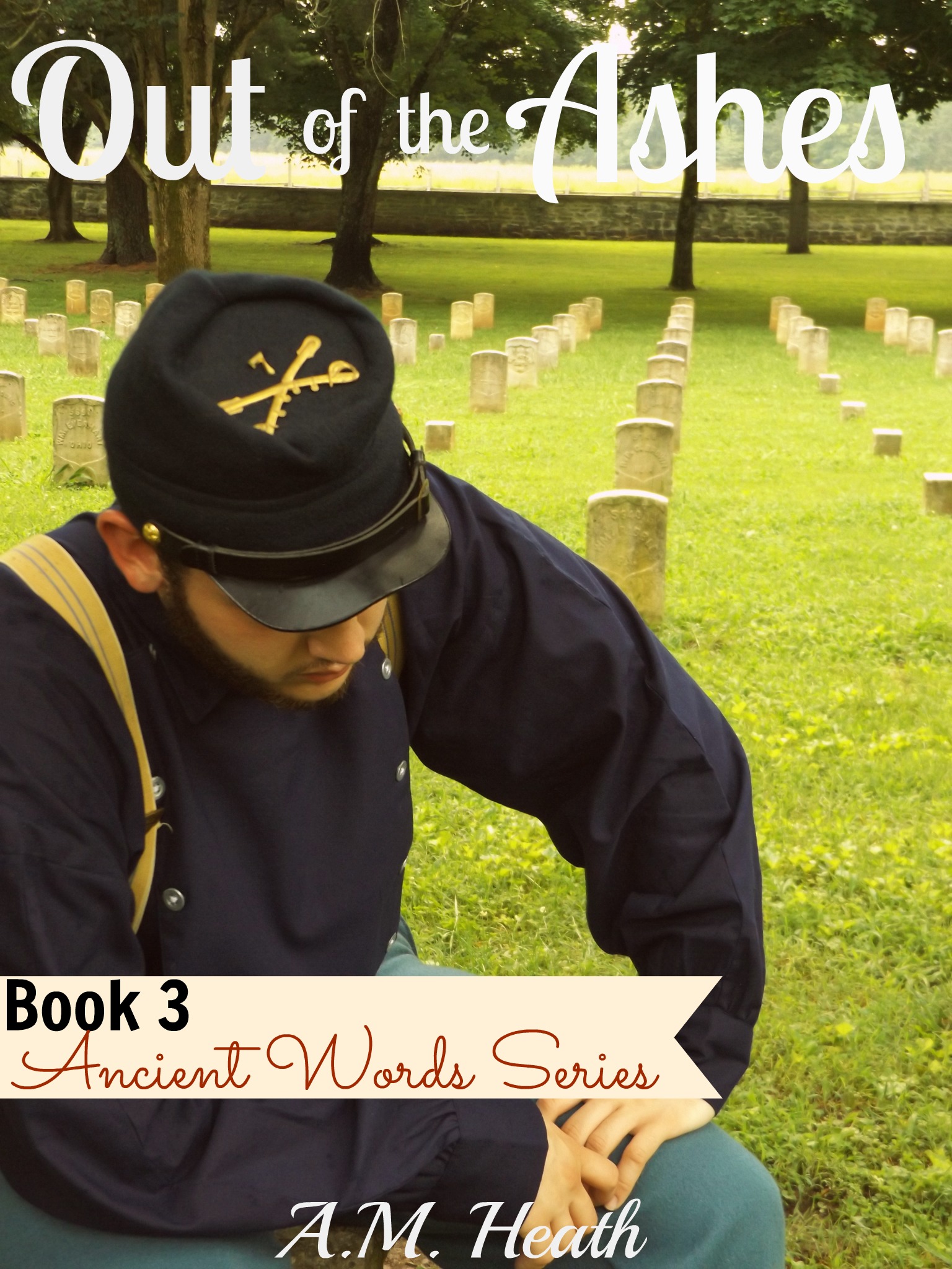
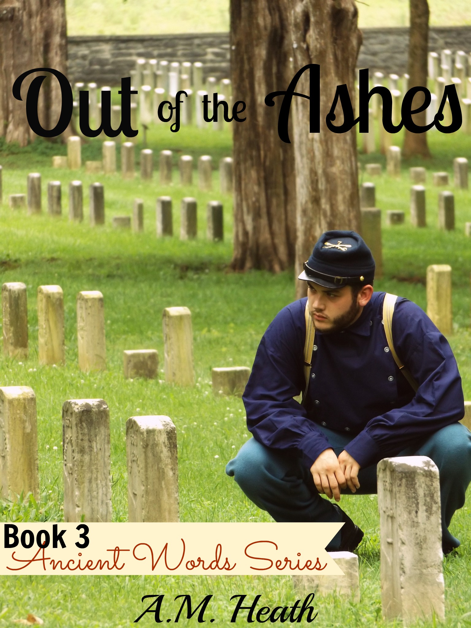
I’ve listened, taken notes, and studying the pictures. I’ve selected the pictures that stood out to me as having more potential and have added the cover art.
The choice is still just as difficult. In fact, it’s getting harder! So I still need some feedback from you. As before, comment either here or on the Facebook link. Give me your top 2 picks and the order that you rank them. And please, let me know why. I’d like to hear what you see when you look at the cover. Also take a look at the other 3 covers in the series as you consider your favorite. *Note: Cover art is in rough draft form and can be altered, so don’t be put off my slight blunders. If you have any suggestions for you favorite cover, I’m all ears!
As before, I have the final say and do NOT select a cover simply based on popular vote. But your input does persuade me. I’ll share the official book cover next Monday here on the blog!
The cover art for the series so far:
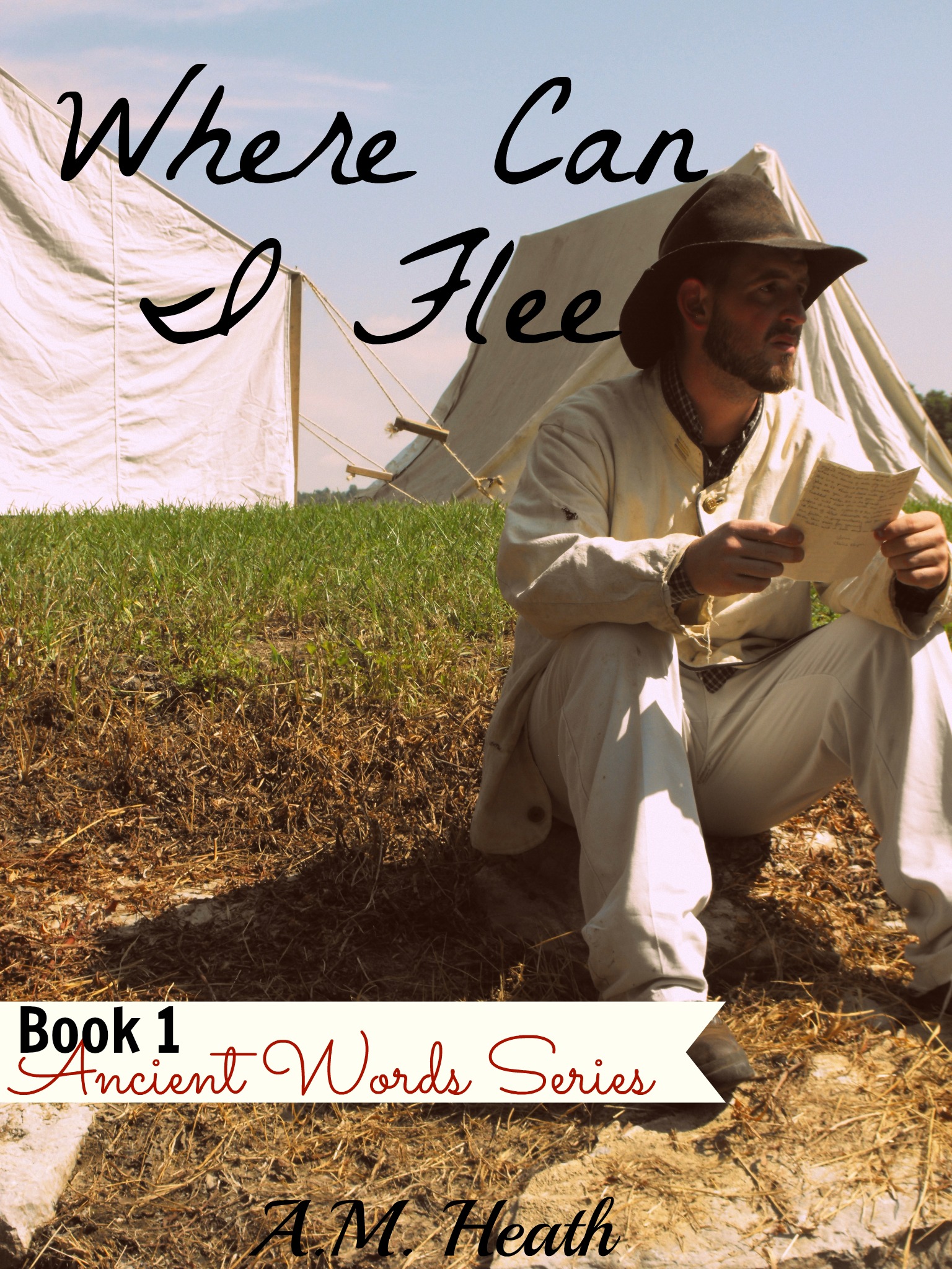


Which cover pulls you in? Which cover completes the set?
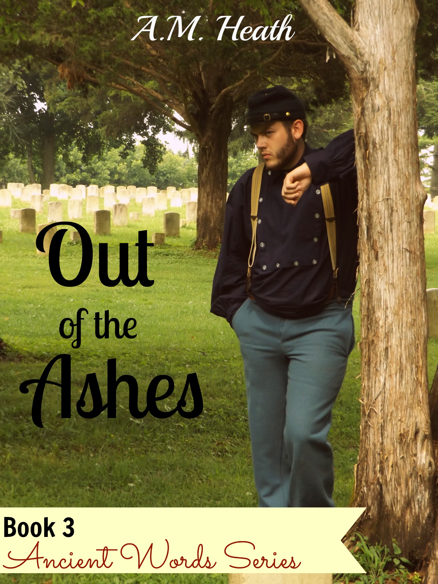
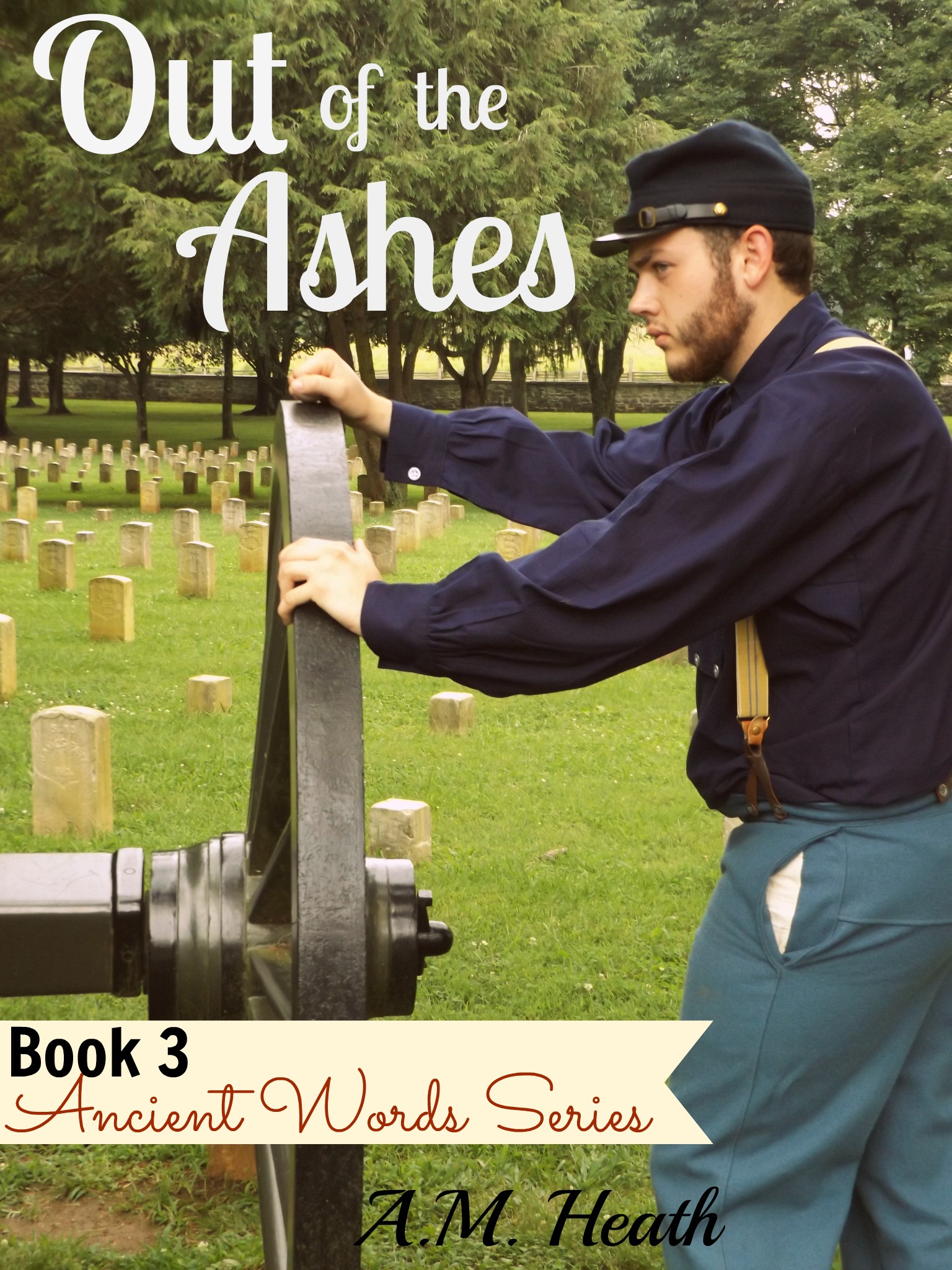
Tree #2
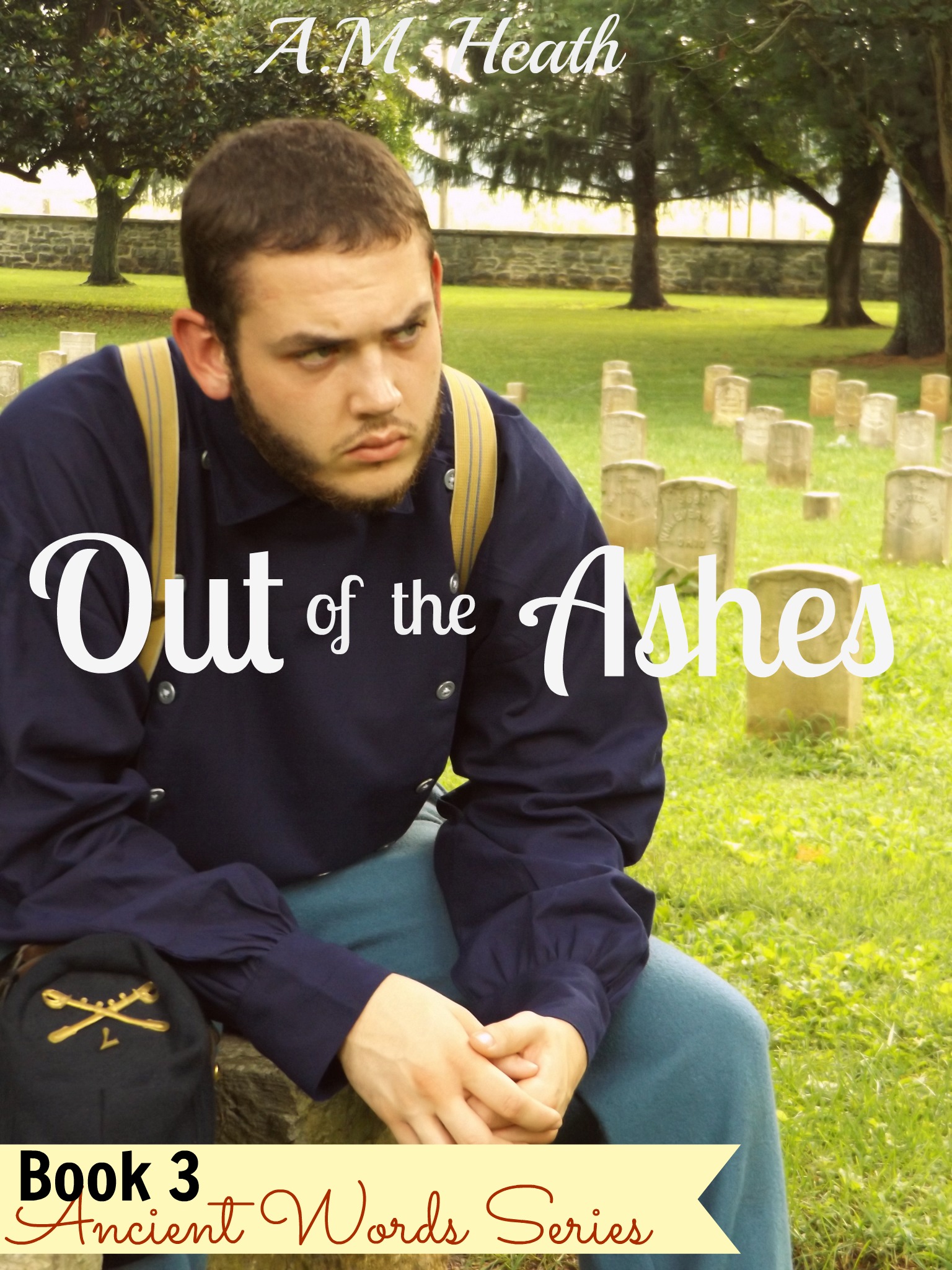
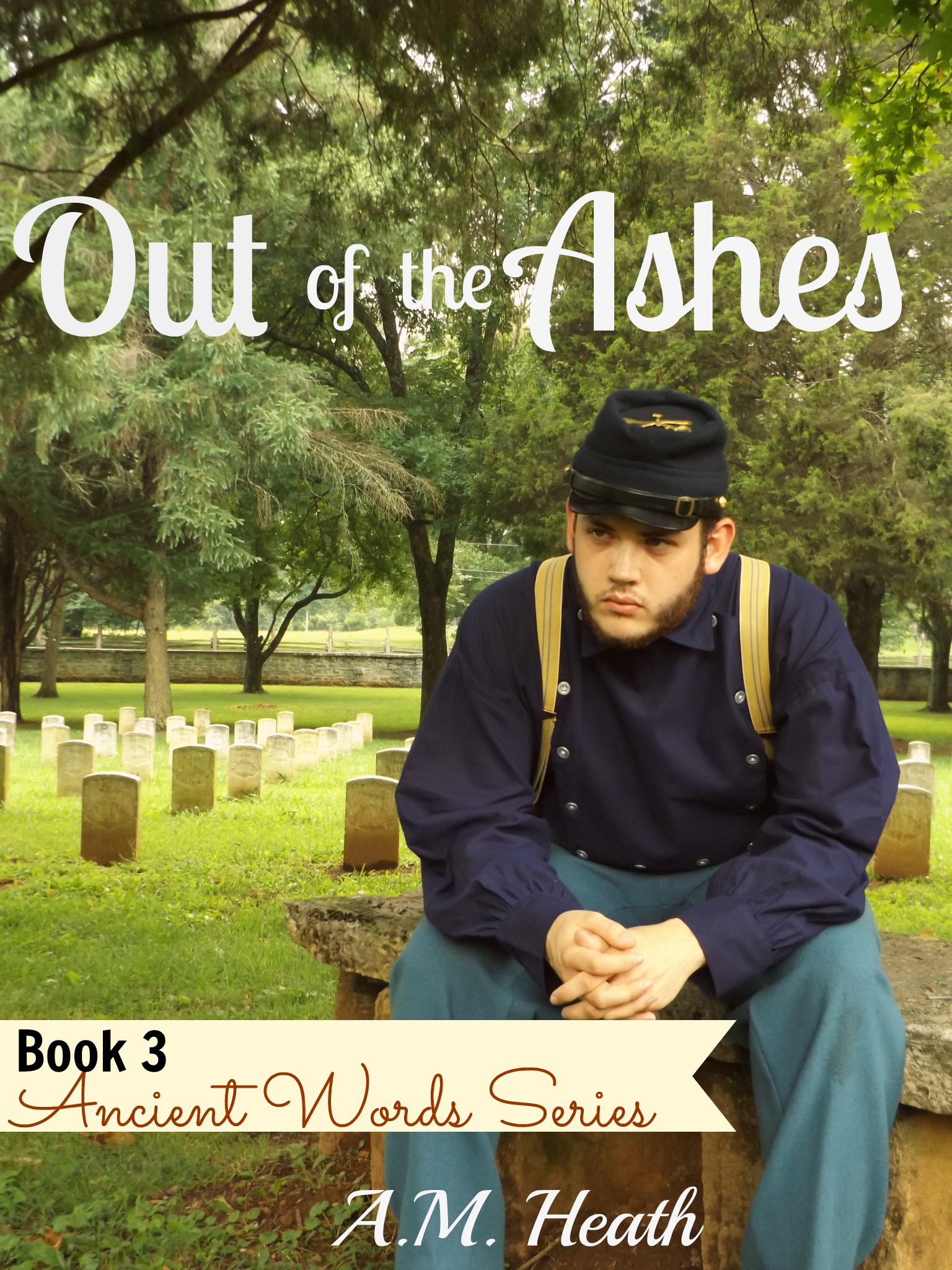
Bench #3
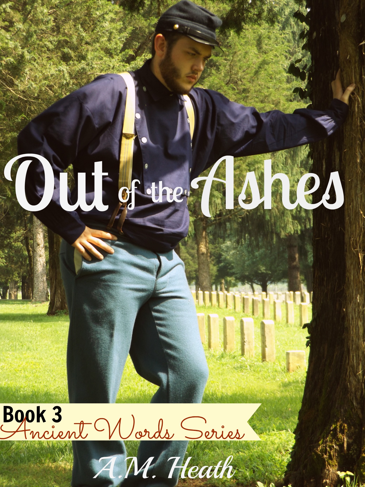
Tree #1
Squat #1
Bench #2
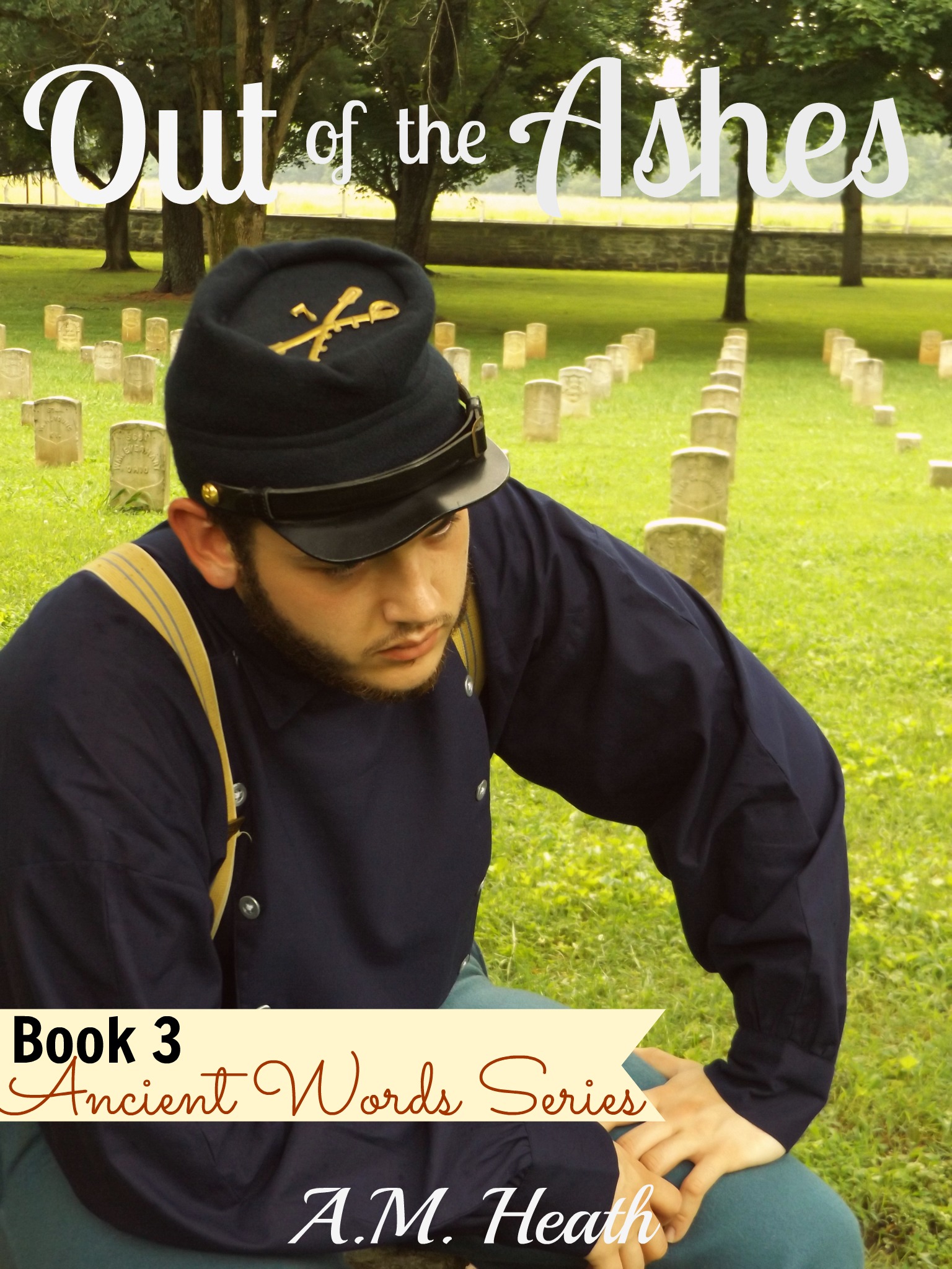
Bench #1
Squat #3
Union #2
Bench #5

Squat#1 and Union #2. I am amazed at how different they look with words!
LikeLiked by 1 person
The words help make it all official and it puts that certain “book cover” style to the picture. Thanks for voting!
LikeLike
#1 Tree 2
#2 bench 5
#3 squat 3
The words make all the difference! These were my choices just based on what cover would draw me in to a book if I were looking to buy one at a bookstore.
LikeLiked by 1 person
Thanks very much, Kimberly!
LikeLike
Bench #5, Squat #3 The other covers all have seated people. 2 are looking right and 1 is looking left. these both have him looking left, to even them out.
LikeLiked by 1 person
Thanks for the input! 🙂
LikeLike
Hard to decide, but I like Tree 1 for the look of it and Bench 5 for the look on his face – like he’s looking to the future.
LikeLiked by 1 person
Thanks, Sandra! It is a tough choice!! Thanks for voting!
LikeLiked by 1 person
1st pick would be squat 1 and 2nd pick would be squat 3…I like these two because they both look amazing with the words on them and they also seem to ‘fit in’ with the other three covers. They are the ones that I believe would make me pick up the book to look at it in a book store, just due to the cover art!
LikeLiked by 1 person
Thanks a lot, Mandy!!
LikeLike
Tree #2 pulls me in, because his face and posture look defeated and yet the title says there’ll be hope. (Except he’s facing the wrong way for the earlier point about evening out the directions the different characters face. But tree #1 just looks like he’s unhappy. Not defeated. Could you reverse tree #2, or would that make an insignia backward?)
Bench #1 is my second choice, because the hidden face intrigues, and the body language/cemetery still says defeat. But it doesn’t pull me like my first choice. (I’m not your target reader, either, because historicals aren’t my main go-to.)
One question that you may have answered in earlier posts: why change the font from the thinner italics to this more upright one? I like the font, but it doesn’t match the other books.
LikeLiked by 1 person
Thanks for the feedback! I couldn’t find the same font I used on the others and just liked this one. I can take another look at it and see if I can find something that matches better. I actually forgot that I wasn’t using the same font. Lol And you’re the first to bring it up.
It was hard to choose, but I did finally select a cover. I’ll reveal it Monday. 🙂
LikeLike
Looking forward to seeing your final choice!
LikeLiked by 1 person