

 Over the last two weeks, I broke down the process of a single book cover and shared some special moments behind my photoshoots. Today, I want to fill you in on what happens after the photoshoot.
The first step is to view the pictures. I’ve taken anywhere from 161 pictures to over 300 in a single photoshoot. After thumbing through them all, I sort through them again but this time I pull out anything that jumps out at me.
Then I sort through those pictures and try to narrow them down to one favorite pic per pose. If I can’t choose only one, I don’t stress it yet.
Taking the thinner selection, I thumb through them again and force myself to weed them down.
The Polls are Open: Now that I have a smaller selection, I share these with other people. I’ve shared them openly here on the blog in the past, but have recently moved the voting process to my Street Team as an added perk for them. I ask for their top 3 favorites and the reason why they chose them. It’s always interesting to hear why certain pictures draw people to them. I’ve received some very insightful answers over the years and it always helps me narrow down my search.
From there, I take the top picks and add the cover art to them. I typically have a personal favorite that didn’t get much love during the voting process and I always pass it through this round. It’s been surprising in the past to see what happens. Sometimes the overlooked one makes a great comeback and sometimes it continues to get ignored.
With the cover art (title, name, and series logo) in place, I ask them to vote for their favorite and to tell me why.
I take into consideration which pictures are more popular with the crowd, the reasons why certain pictures are drawing them in, or why some pictures are turning people away, and then which picture speaks the most to me.
Choosing the Winning Picture: I enlarge the photos and stare at them for hours. Lol No, I’m serious!! There’s a constant war of “This one? or That one?” going on in my brain. I keep flipping through them. Often times, I pull aside a close friend and make her thumb through them with me. Together, we pick apart the pros and cons for each and narrow them down even further. By the time I’m sitting with the final 2 or 3, I’m really about to lose my mind. It’s a big decision and I’m the one in charge of pulling the plug. The longer I scroll through them (keeping in mind the voters’ favorite and comments along with my pros and cons), the more obvious the winner becomes. Before you know it, I can’t keep that dumb smile off my face whenever I see my cover. And that’s when I know. Lol
Sometimes the popular vote wins. Sometimes the crowd persuades me to see something special in a picture that wasn’t my original favorite. But sometimes I step out on my own and select a picture that I feel best fits the story even though it didn’t win the popular vote. And you’d think the work would be over, but it’s just beginning . . .
Finalizing Cover Art: Once I have a final picture, the time comes to finalize the cover art. I know that I had mentioned that the cover art was already on the picture. But that was more of a draft. Now it’s time to get picky and make sure every detail is perfect. Unless you’ve done this sort of work, you’d be amazed at how tedious this process can be. Professionals that don’t seek outside opinion may make faster work of it, but since I work with the wise counsel of others it takes a TON of back and forth ideas before the cover art is finalized. Here’s a quick rundown of what it looks like:
Am I using the best font for the title? Or should I choose this one? Or this one? How about this one?
Is the title large enough? Too large?
Is the title in the best position? Or should I move it?
Am I using the right color of font on the title? Do I need a shadow?
Is my name in the right color?
Should I move my name here instead?
Is the series logo large enough? Too large?
How do the fonts look together? If I change this one should I change this one? How about this combination?
Color selections on the series logo: right or wrong? How about this change? Or this one? Does the picture need a filter?
Are there any sections of the picture that are too dark or too light or too blurry? Can it be fixed? Or over fixed?
After asking myself close to 600 questions in a matter of 24 hours, I finally have a cover I can be proud of. Again, this may not be every author’s experience. But this is mine. I hope you have enjoyed the sneak peek.
Was there any part of the process that surprised you?
For a special treat, I’m going to share the runner-ups and the reason each winning photo won. Please remember that ALL photos fall under copyright law and cannot be used for any reason outside of promoting the work of A.M. Heath.


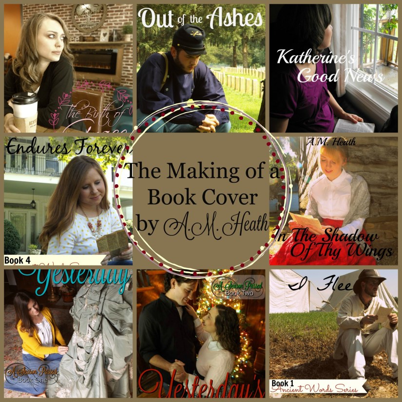
Where Can I Flee: When it came down to the final two, the question was “Should he look down or up?” One of the other favorites was the shot I took from the other side of the creek. At the end of the day, the “looking up” pose won. There’s a sense of contemplation on Frank’s face and that’s perfect for the story! But I can’t even begin to tell you how many times I flipped back and forth between the up and down pose before selecting it.


In the Shadow of Thy Wings: The runner-up photos each captured that private moment where Sally is reading a letter from Frank. I didn’t go with the popular vote on this one but stepped out with my own selection based on the unique lighting and the building in the background that sets up the image that Sally had slipped away from her busy life to enjoy this particular letter.


Out of the Ashes: Again it came down to head up or down. Some of the other favorites included standing poses like this one against the tree. But in the end, the squatting pose best fit the rest of the series and the emotion and angle of the background was a winner. I can’t remember where the popular vote fell with this one.


His Love Endures Forever: The runner-up on the left was a fast favorite of mine. It was one that I knew would be in the running the moment I took it. One of the perks to the picture on the right was the view of the house. But in the end, I was drawn to the cover shot because the colors seemed to pop more. And this time around, it was also the popular vote.


Katherine’s Good News: Ahhh the picture of longing. Katherine is someone who had locked herself away but is missing someone. The picture on the left was a favorite of mine. But in the end, the close-up shot held more appeal. Plus, it didn’t require any photoshopping unlike the wedding photo seen in the runner-up shot. 😉


If Only It Were Yesterday: Sometimes the hardest shots to pick between are the ones that are nearly identical. That was the problem with WCIF’s cover and that was the problem with this one. While each photo carries a wistful longing in the face of Liz, in the end, I went against the popular votes and selected a picture that I felt captured the moment in an unstaged way. The finished product looked like a private moment which fits the story perfectly.


Yesterday’s Christmas: On the right was one of the popular votes. And on the left was my personal favorite. Sigh. I still can’t help but love that seemingly private moment between Glenn and Betty. For me, there were so many factors pulling for this one. Even when no one noticed it, I kept it in the running and had nearly selected it as the cover. After sleeping on the decision and praying the whole night, I woke up and selected the winning cover instead. We’ll certainly see this runner-up shot again in the advertisements. But what won me over was the appeal of the close-up shot and the Beauty and the Beast feel of the selected cover. And just in case you missed the memo, Yesterday’s Christmas is inspired by Beauty and the Beast so that factor was a rather important one.


The Birth of Grace: There was something just plain right about the picture on the couch. There was a strong coffee shop image here that I loved. I had a couple other poses on this couch up for consideration. And I loved the overhead shot. But in the end, the background was more interesting in the chosen picture versus the couch shot. And I LOVED having the tree in the background since so much of the story revolves around Kaitlin’s ancestors.
It amazes me, looking back at these runner-ups. I can remember being so torn between two pictures. But now, looking at them, I couldn’t imagine choosing anything differently.
How do you feel about viewing the runner-ups? Would you have chosen differently? And most importantly: Head up or head down? Lol

I think you picked the perfect shot for each cover! And personally, I like head up better, just because you get to see more of the character’s face. If there is a person on a book cover, I like to be able to tell what they look like!
LikeLiked by 1 person
Thanks so much!! And I agree. I like seeing their faces too. But strangely enough, the pictures without heads appeal to me too for some reason. lol
LikeLike
I like the ones that ended up as the chosen ones. Most of them have the model as a large part of the cover. They seem to fit together well. Thanks for the inside scoop. I’m glad I could vote on a few of them!
LikeLiked by 1 person
Thank you!!! And I’m so glad you enjoyed it! And thanks for being part of the voting process. The feedback is always very helpful.
LikeLike
I definitely like the head up but you did a great job picking the perfect cover. There may be things a person likes better than another but to me you need that photographer mind to see things we wouldn’t noticed. Thanks for sharing.
LikeLiked by 1 person
Thanks so much, Brenda!!
I’ve certainly had some help in fine-tuning that photographer mindset. Some of the feedback over the years had certainly pointed out things that I hadn’t considered. It always amazing me at some of the things people see that I don’t. I think that’s where getting that feedback is so vital to the entire process.
And thanks so much for being a part of it all!
LikeLike
I go with the ones you picked for some of the same reasons. Thank you for sharing all these behind the scenes in making your book covers. Blessings on your writing and new covers.
LikeLiked by 1 person
Thank you so much, Marilyn! Thanks for following the series.
LikeLike